ITC REBRAND

A Brand as Bold as the Work We Produce
Founded in 1983, ITC Cutting Edge has built its name on craftsmanship, reliability, and high-impact print solutions. For decades, the company has helped businesses bring their ideas to life through quality production and hands-on service. But as the print and design industry evolved, so did ITC. With expanded capabilities and a growing vision for the future, the brand itself needed to evolve alongside the work.
The decision to rebrand was driven by one clear goal: create a cohesive, recognizable identity that reflects the creativity and innovation ITC delivers every day. Over time, visual inconsistencies had developed across marketing materials, social media, and digital platforms. Fonts, colors, and graphic elements lacked a unified structure, making it harder to build strong brand recognition. While the work remained cutting edge, the brand presentation needed refinement to match the level of expertise behind it.

One Brand. One Voice. Unmistakably ITC.
At the same time, ITC Cutting Edge was expanding. The company began moving further into the custom design space, offering branding and creative collateral for other businesses — not just print production. In addition, ITC introduced unique print solutions such as re-board applications and layered ink techniques, pushing beyond traditional print offerings. These innovative services demanded a stronger, more modern brand presence that could confidently represent both legacy and forward momentum.
The rebrand focused on creating balance — honoring ITC’s history while positioning the company for long-term growth. The objectives were clear: strengthen brand recognition, establish a cohesive visual identity, improve digital presence, and develop clear brand standards that could scale across every touchpoint. This meant refining typography, defining a bold and strategic color palette, modernizing the mascot, and building a structured system for backgrounds, graphics, and brand usage.

Built on Experience. Designed for What’s Next.
More than just a visual refresh, this rebrand was about alignment. Alignment between who ITC Cutting Edge has always been and who it is becoming. A unified brand system now ensures consistency across print, digital, and social platforms — creating a recognizable presence that supports expansion into creative services and innovative print solutions.
The result is a brand that feels confident, cohesive, and unmistakably cutting edge.


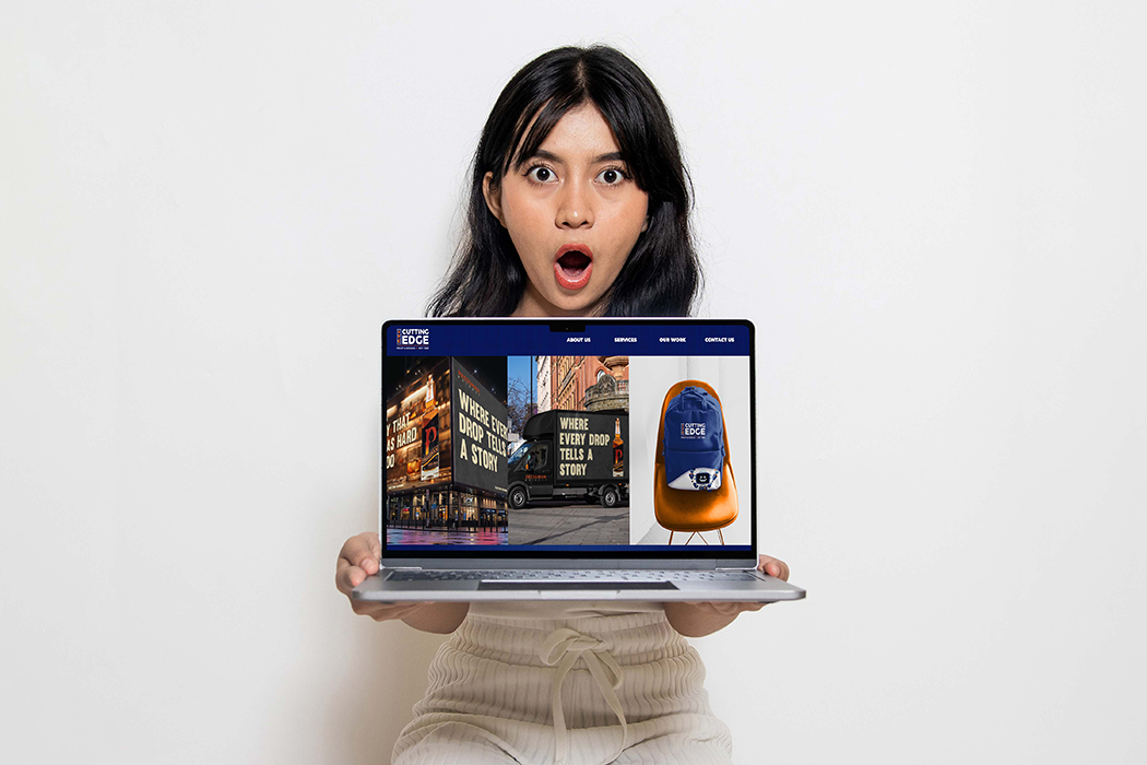
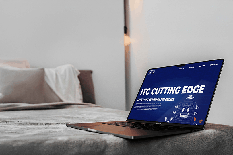
Bold by Design — Even Online
As ITC Cutting Edge expanded its services and refined its brand identity, the website needed to reflect that growth. The previous site no longer showcased the company’s full capabilities or its bold, creative direction. The redesign focused on aligning the digital experience with the updated brand system.
The new website features strong typography, a defined color palette, and consistent background elements that create a cohesive visual presence across every page. Messaging was clarified to highlight expanded services, including custom branding, creative collateral, and innovative print solutions like re-board and layered ink applications. Streamlined navigation and stronger calls-to-action improve user experience and make it easier for visitors to explore, engage, and connect.
The result is a modern, structured, and visually impactful website that supports ITC’s growth and reinforces its position as a creative leader in print and design.

Sharper Than Ever
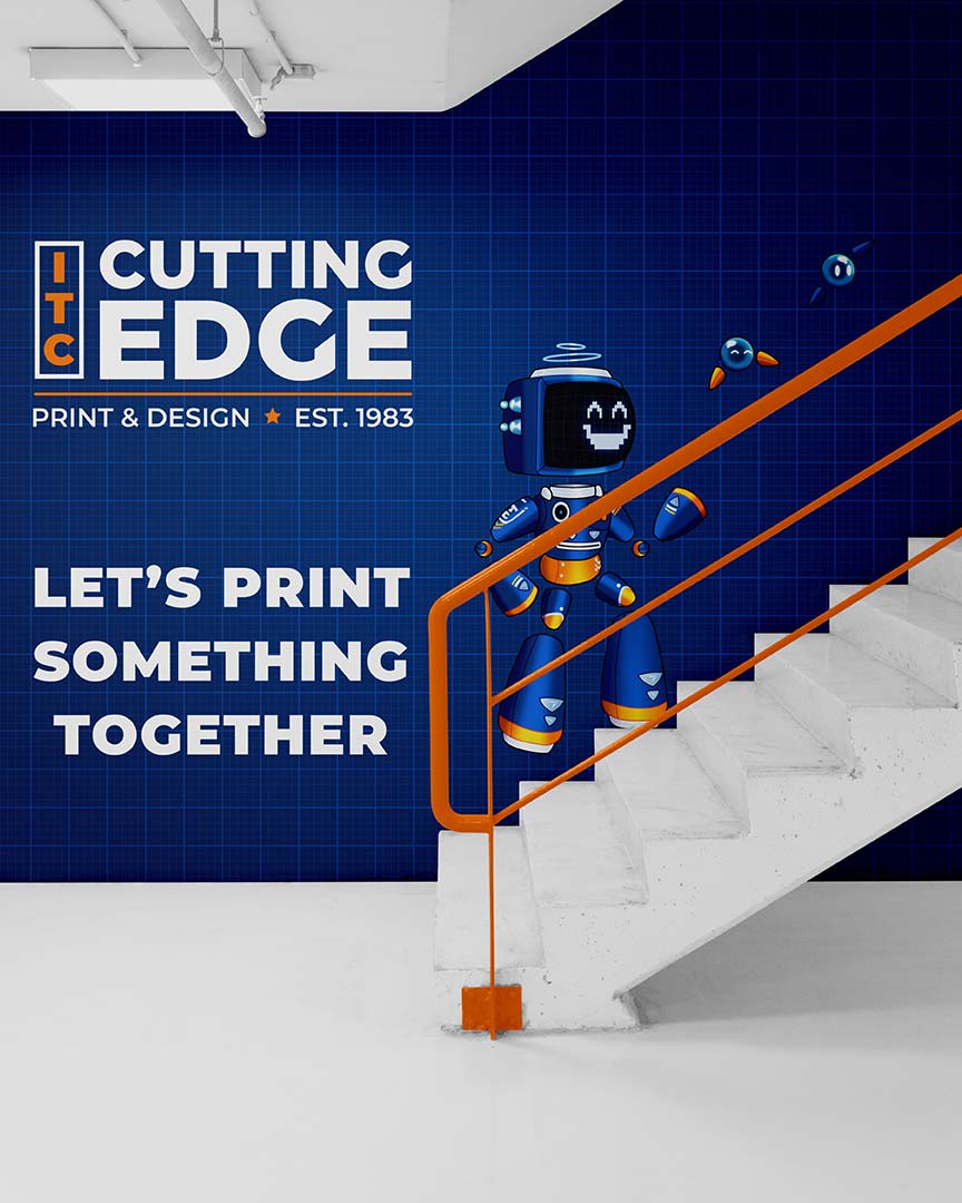
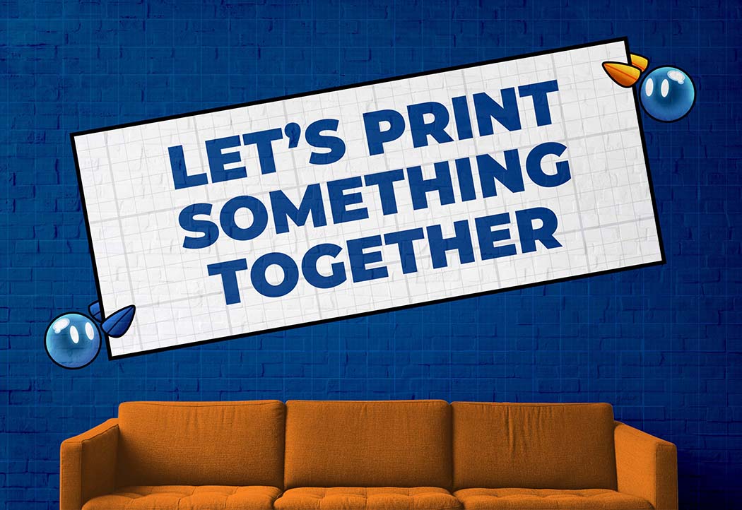
One of the most meaningful updates in the ITC rebrand was the evolution of our mascot, TC. Once marked with scuffs and scratches that reflected decades of hard work, he’s now polished and refined to represent the precision and forward momentum of ITC Cutting Edge today. TC is our printing and design expert robot, built from the very tools of our trade, with parts of his body inspired by print machinery. His sidekicks Dot and Pixel — who double as his hands — help him bring bold ideas to life. Together, they represent the creativity, collaboration, and innovation that drive everything we do.


Strategic by Design
The rebrand of ITC Cutting Edge was rooted in strategy, not just aesthetics. The goal was to define a clear brand vision that reflects both the company’s heritage and its expanding creative capabilities. Since 1983, ITC has been known for quality and reliability. The new brand builds on that foundation while positioning the company as a bold, modern leader in print and custom design.
At the core of the strategy was clarity. ITC is no longer just a production partner — it is a creative force helping businesses develop branding, visual identity systems, and impactful collateral. The brand needed to communicate confidence, innovation, and forward momentum while remaining approachable and grounded in experience.
The vision moving forward is simple: create a cohesive, recognizable presence across every touchpoint. From typography and color to mascot usage and digital design, every element works together to reinforce a unified identity. This structured yet flexible system allows ITC Cutting Edge to grow into new markets — including custom branding, re-board applications, and layered ink techniques — while maintaining strong brand recognition.
The result is a strategic identity built for longevity, creativity, and continued evolution.